Cork tenants face 2.3% jump in rent in past 3 months
Just a small piece related to a recent article I wrote about rent prices in Cork.
The national quarterly index published by the Private Residential Tenancies Board is the most authoritative resource for such information as it contains a database of more than 300,000 rental agreements.
However, PRTB press releases understandably don't allow for focus on rents at a micro-level.
The situation is Cork reflects how rents can vary according to geography with certain locations proving more popular (and thus more expensive than others).
Tourism in Ireland 2013 - A Gathering of Statistics
It might not have been a record year for overseas tourists but the industry recorded a major rebound with the number of foreign visitors up 6.4% to almost 6.7 million.
The Gathering initiative was widely deemed a major success with over 5,000 special events credited with attracting an extra 270,000 visitors from abroad and generating €170m in additional revenue.
But tourism in Ireland is not evenly distributed and tourism interests in some parts of the country are annoyed that regions are not equally promoted - a concern that has grown this year through the large-scale publicity surrounding the launch of the Wild Atlantic Way tourist route.
This blog seeks to provide some insight to the performance of Ireland's tourism industry by the 26 counties individually and to identify any trends at that level.
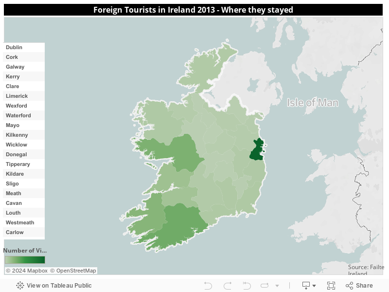
First of all, the general picture for where foreign tourists holidays in Ireland last year confirms that a few counties dominate all the others in terms of visitor numbers.
The map above shows that Dublin, not surprisingly as the country's capital and main gateway, is the main tourist destination by some distance attracting almost 4 million overseas visitors in 2013. The other main popular tourist area is the western seaboard between Galway and Cork, while the Midlands region has relatively small numbers of visitors from abroad - just 22,000 in the case of Longford.
(It should be noted that the figures allow for the fact that foreign tourists visit more than one county.)
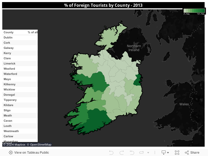
When looked at in a slightly different fashion - as the percentage of all foreign tourists to Ireland which each county attracts - the regional imbalance is again quite stark.
More than half of all counties are visited by less than 3% of all overseas visitors which are all located either in the Midlands or north-east. In contrast, Dublin is visited by 60% of all foreign tourists.
Cork, Galway and Kerry are the only other counties to achieve visitor levels above 10% of all tourists. Clare and Limerick are the only remaining ones to have visitor levels more than 5%.
However, while the above graphs and tables confirms the existence of a two-tier tourism market in Ireland with Dublin and coastal counties between Galway and Cork being popular destinations and everywhere else largely off the main tourist drag, the results for 2014 are more rosy for the latter group than might first appear.
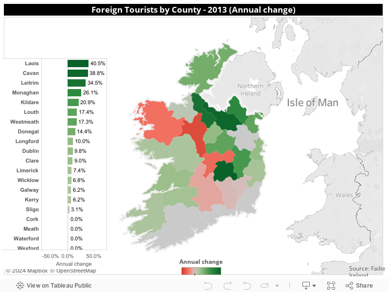
The next graph shows the change in overseas visitor numbers for all 26 counties last year compared to figures for 2012.
Somewhat surprisingly and contrary to expectation, it is the regions without a strong traditional tourism base that recorded the biggest growth in foreign tourist numbers in 2013.
More than half of all counties recorded a growth in overseas visitor numbers with Laois, Cavan, Leitrim and Monaghan having the highest increases.
While to some extent small increases/decreases will result in large percentage changes in counties with low overall visitor numbers, there is still a sense that the uniform nature of the increase in such regions last year suggests some type of pattern.
One likely explanation is the impact of The Gathering which aimed to entice people with family connections to Ireland back to their original homeplace of their relatives/ancestors.
The initiative is widely acknowledged as being a major success, not solely in terms of attracting extra visitors but also imbuing towns and villages with a new sense of community in many cases.
Foreign tourist numbers were static in four counties - Cork, Meath, Waterford and Wexford,
The figures for Cork are somewhat disappointing as it would be expected that the country's second favourite tourist destination would share some of the overall growth. However, the unchanged figures might indicate the impact of cutbacks on the number of routes directly serving Cork Airport.
Despite overall growth in tourism in 2013, six counties actually recorded less visitors than in 2012 with Roscommon, Offaly and Mayo seeing a particularly sharp decrease.
Is it possible that all those "boil water" notices in Roscommon are impacting negatively on the county's tourism sector?
A new report by the Residential Property Tenancies Board to mark the organisation's 10th anniversary examines if rent controls, which are used in many EU states, would have a benefit effect on the Irish market.
The main conclusion is they wouldn't.
But the report also provides some interesting statistics.
* Only 17% of tenants are happy renting.
* 65% of landlords own just one property
* 29% of landlords want to sell their property as soon as they can
* 68% of tenants are renting because of their inability to buy a house
Despite slight decreases in 2011 and 2012, the number of inspections on dwellings in the private rented sector per year has been increasing since 2005.
The total number of inspections in 2013 was 21,223 which is 211 per cent higher than the 6,815
carried out in 2005.
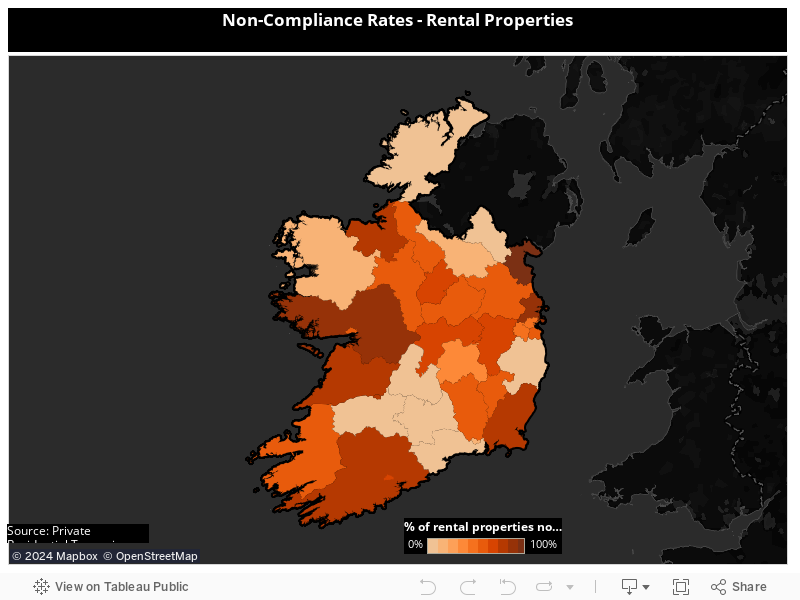
The map below shows the percentage of inspections in each local authority area which failed to meet regulatory standards.
The results highlight major differences in /non-compliance levels between various local authorities ranging from 0% in Donegal, Limerick and Waterford to 100% in Louth.
Such findings might suggest there is a need for greater standardisation in the inspection of rental properties around the country.
Ross O’Carroll Kelly warned it would be a problem and so it has come to pass.
Myhome.ie has blamed the confusion over postcodes for Terenure for a series of embarrassing errors in its recent analysis of house prices in 2014.
Everybody who works with figures or statistics is prone to error. But the knowledge of that universal truth is why all statistical exercises should be checked and re-checked. Indeed it's desirable that as many sets of eyeballs as possible should verify the data. (The same truth applies to journalism which is why the erosion of the role of sub-editors is so worrying)
Anyway, it was surprising to recently identify serious errors in a report on the property market published by MyHome.ie. The cynic in me ensured my first instinct was to think here is another estate agency talking up the property market but we'll have to give them the benefit of the doubt.
As I was clarifying the matter with MyHome.ie in September, they revealed that they had just asked The Irish Times (which ironically owns the MyHome.ie website) to print a clarification in the newspaper's property section where they admitted they had got their figures wrong about the volume of sales in the Terenure area.
It appears the same issue led to the mistake outlined below.
But Dublin's most famous fictional Southsider warned long ago that the reclassification of Terenure from the postal district of Dublin 6 to the Dublin 6W would cause problems. MyHome.ie admitted that properties in Dublin 6W were double counted in their half-year analysis of 2014 figures from the Residential Property Price Register.
According to the press release issued by MyHome.ie on September 10, it shows figures for all half-year sales (January-June) in Co Dublin between 2010 and 2014.
The interesting figures are the final row marked "Total" which, for example,claims 5,240 properties were sold in the capital in the first six months of this year.
Similarly, MyHome.ie provides figures on the value of those sales.
Again, the final row contains figures for the value of Dublin residential property market sales for Q1-Q2 of each year with sales of €1.83bn in the first half of 2014.
However, a relatively simple analysis of the Residential Property Price Register for the first six months of each year reveals quite a different set of figures and shows that MyHome.ie have overestimated the growth in the Dublin property market by a sizeable amount.
The differences are highlighted in the table below and they reveal that MyHome.ie's figures exaggerated the true number of sales in Dublin by 200-300 in most years and their related value by more than €100m in a majority of years.
As you can see, the cumulative errors overestimated sales in Dublin over a five-year period by almost 1,200 properties and their value by almost €577m
A very helpful PR person on behalf of MyHome.ie explained the miscalculated figures were due to a "data retrieval error."
Which has all left me wondering whether it would be better to live in a phantom property than a ghost estate!
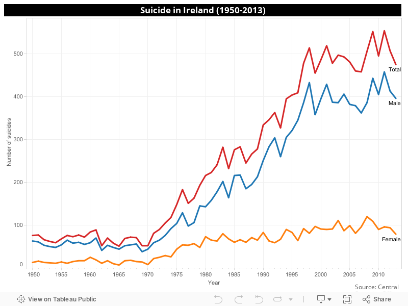
The Central Statistics Office released figures about suicide levels in Ireland recently which has again focused welcome attention on an issue that has probably touched everyone at some level during their life.
This is a lengthy blog containing a lot of statistics on suicide in Ireland but if you only have time to look at one piece of information, I would ask you to check out the final graph......which I believe is the most instructive and important.
The latest CSO release was to formally publish suicide figures for 2011 - the time lag being explained by the fact that the official total is often not able to be confirmed until inquests are held which can occasionally take a number of years following the person's actual death.
For that reason the figures for 2012 and 2013 in the graph below are provisional.
The steep upward trend in male suicides since the 1970s is truly shocking. However, there is a slight caveat as the CSO does warn that the data should be interpreted with care due to population changes, attitudes to death from self-harm, the introduction of the Form 104 in 1967 and it's revision in 1998, the Criminal Law (Suicide) Act 1993 and other factors would affect trends over time. Nevertheless, the graph would suggest the number of people (particularly males) who take their own life has been steadily increasing over recent decades even allowing for such factors.
The landmark figure of 500 suicide deaths was breached for the first time in 1998 and has exceeded that number on five other occasions since. One can only speculate about the significance of the economic downturn which began in 2008 as a factor in some of the highest suicide totals occurring in the last few years, reaching a record high in 2011 with 554 deaths. On average 400-450 males die by suicide each year in recent times.
The number of females who died by suicide sadly peaked in 2008 - the first and only year ever that more than 100 women took their own life when the figure reached 120. Thankfully, the number has been coming down, falling to 79 in 2013 - the lowest total since 1996. Since the 1980s the annual total of female suicides has with rare exceptions remained in the range of 60-90 deaths.
The ratio of male to female suicides has generally been around 4:1, although that increased to 5:! in 2013.
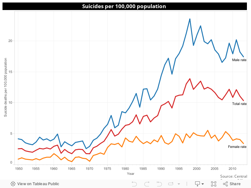
Using the CSO figures again, if we translate them to the crude (unadjusted) rate of suicides per 100,000 population, the graph suggest the prevalence of suicide in Ireland actually peaked just prior to the new millennium in 2000 with our fast rising population clearly contributing to the downward trend in recent years. (Age standardised rates for death by suicide do not alter the results to any notable degree)
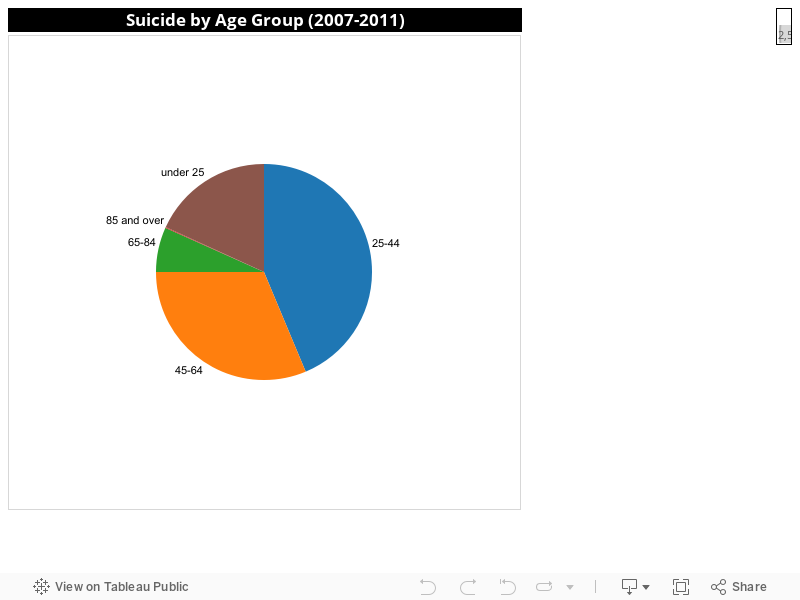
As for age....there does not appear to be any significant difference between males and females in the breakdown of suicide by age group when figures over several years are taken into consideration. However, in 2011, the male suicide rates were highest in the 45-64 age-group (28 per 100,000) while women’s were highest in the 25-44 age-group (almost 7 per 100,000). As the graph below shows, three-quarters of all suicides occur between 25 and 64 years.
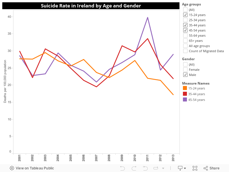
A closer look at a breakdown of suicide rates by age and gender confirms that suicide is more prevalent among males than females across all age groups. Last year, there was a welcome decrease in the suicide rate among young males but a worrying increase among men aged 45-64 years. Among females, there was also an increase in the suicide rate among women aged 45-54 but a decrease in the next older age group 55-64 years.
Overall, the details confirm that the peak rates of suicide in recent years were experienced in 2011.
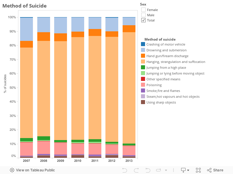
The CSO data also confirms that hanging, strangulation or suffocation is the most common method of suicide by both sexes, accounting for almost 80% of all such deaths last year. Use the interactive graph below to examine suicide deaths by a breakdown of method and gender.
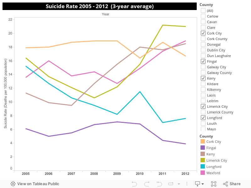
The next interactive graph shows how suicide rates have changed in each of the 34 local authority areas over the past decade. The figures are for three-yearly moving averages - a statistic used to eliminate any blips which could distort general trends.
The graph shows how suicide rates have been persistently high in places like Cork City, while there has been an upward trend in the suicide rate for areas like Limerick City, Kerry and Wexford. In contrast, Fingal has had consistently low suicide rates, while counties like Longford have recorded a downward trend in their suicide rates.
Scroll down the column on the right and tick the box for the area you're interested in to see the relevant data.
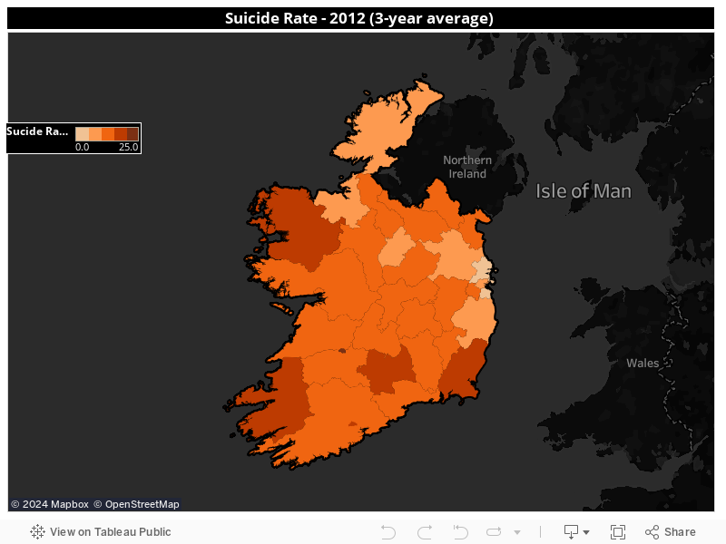
The next graph shows the suicide rate in Ireland on a map. Although it is not easy to see, Limerick City had the highest rate in 2012, while it also highlights how Kerry, Cork City, South Tipperary, Wexford and Mayo also experienced above average rates, while the greater Dublin region has some of the lowest suicide rates in the country.
The national suicide average in 2012 was 11.2 deaths per 100,000 population.
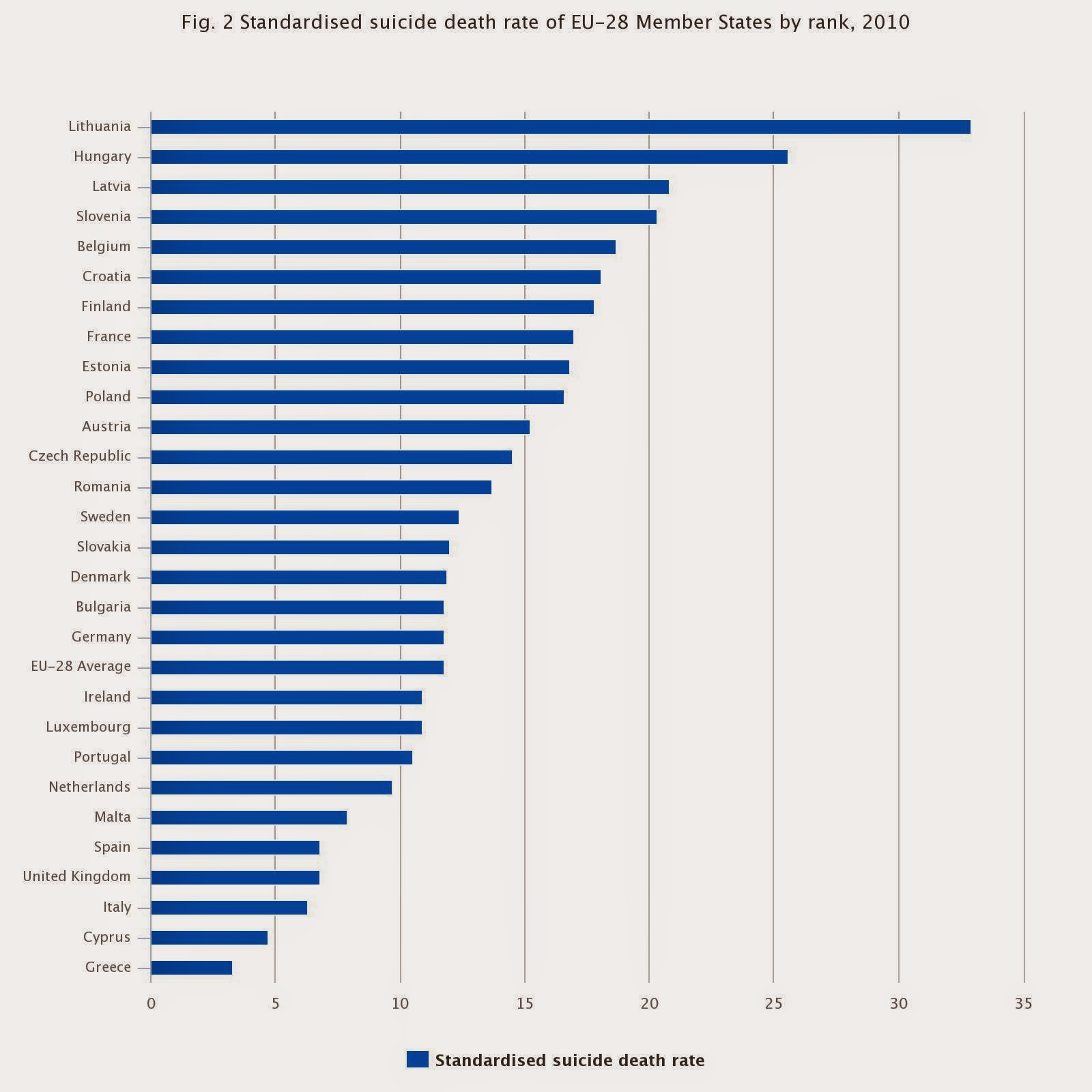
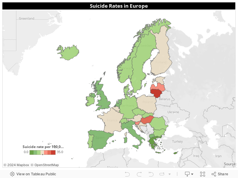
So how does the Irish suicide rate compare with other European countries? The latest comparative figures are for 2010 which show the Irish suicide rate at 10.9 per 100,000 population was just below the EU-28 average of 11.8 per 100,000. However, the CSO warns that such figures should be interpreted with care as suicide registration methods vary between countries. Attitudes to suicide, the level of proof required for a verdict or classification of suicide etc., are also factors to be considered when comparing data between countries.
Or looked at another way..... The map shows no major patterns although the highest rates are in the Baltic states and central eastern Europe.
However, it is interesting that the PIGS countries (Portugal, Ireland/Italy, Greece and Spain) whose economies suffered the most during the recent recession have some of the lowest suicides rates in Europe - a finding which would seem to dismiss the easy link which some might make between financial hardship and suicide rates.
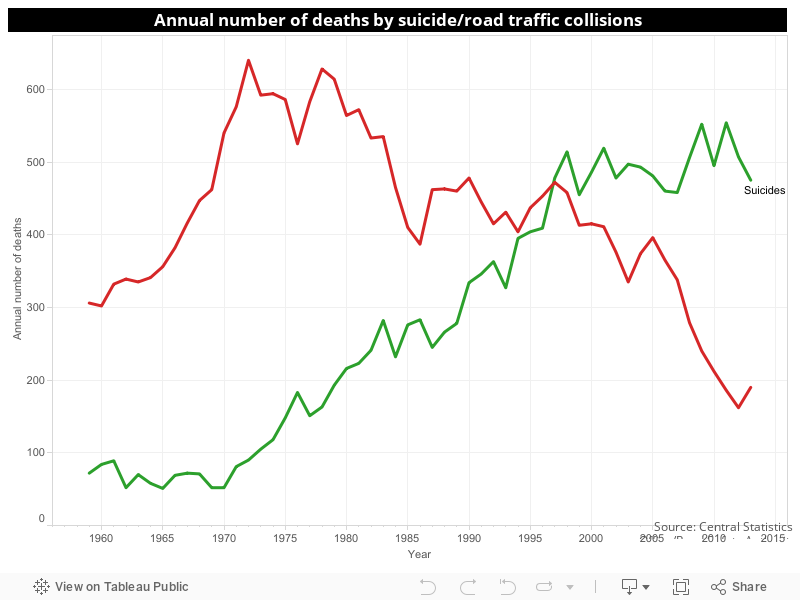
And so to the final chart....and the reason why I believe it is the most important. It compares the annual number of road fatalities with deaths by suicide over the past half-century.
As the chart shows, the number of people killed on Irish roads outnumbered the annual number of deaths by suicide until 1997 when the positions were reversed and have remained so ever since. The dramatic reduction in the past 20 years in road fatalities is a result of direct intervention by successive governments through a number of initiatives including a reduction in blood-alcohol driving limits, random breath testing of motorists and a penalty points system.
It shows what can be achieved by policies driven by political will to tackle a problem. One hopes the same can be done with suicide. The time for waiting is over.
Anyone affected by suicide or suicidal thoughts can contact the Samaritans on their new freephone number 116123, Console on 1800 247247, or Pieta House on 01 6010000.
September is a good month for analysing Ireland's property market for the first half of 2014.
As ever, there have been a few industry reports, such as one by myhome.ie, which understandably focuses on the upbeat news that the number of transactions and their value are up on the corresponding period in 2013.
On its website, myhome.ie provides fine detail on how asking prices are up pretty much everywhere in the Republic.
Given such fine detail, it is surprising (or not really) that such surveys rarely focus on "average" prices actually fetched when properties were sold, especially in 2014 when it seems the green shoots of a new bubble (excuse the mixed metaphor) seem set to grab the nation again.
Why not? Because the figures are nowhere near as positive as the sector would like us to believe? Surely not.
All the following figures and graphs are derived from the Residential Property Price Register which records all residential sales in the Republic.
I've excluded all non-full price transactions from the records which can sometimes comprise about 5% of all sales. However, their exclusion should not distort the picture either nationally or at county level to any extent and helps to provide a more accurate figure in relation to property prices.
For the same reason, I've added 13.5% to all the prices recorded in the Register for new homes as they are exclusive of VAT. The inclusion of the VAT element provide a better reflection of the true cost of property to buyers.
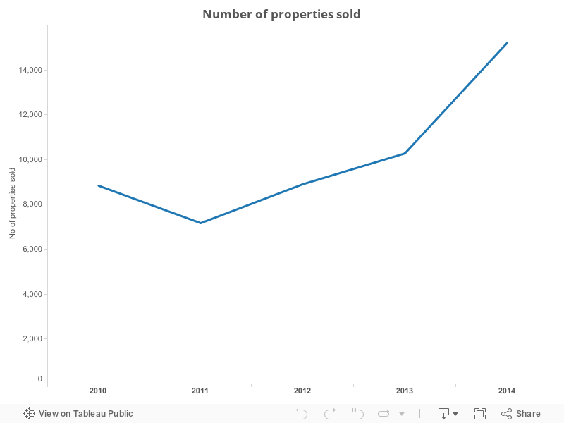
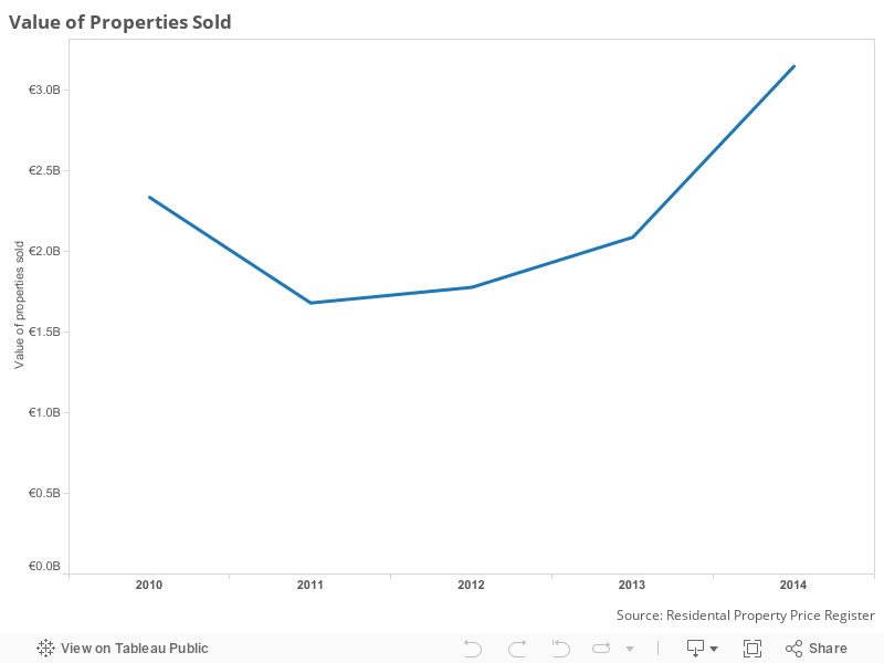
The RPPR while limited in lots of respects provides us with three of the most important pieces of information about the market - the number of properties sold in any period, their value and "average" prices.
The best measure of what most people label "average" prices is the median price - the figure which provides the mid-value of all prices within a specific range. It provides a truer picture of what most people are paying for property as it eliminates the distorting effect that a particularly expensive or cheap property would have on the calculation of the traditional average - i.e total value of all properties/ total count of all properties.
First of all - how much business is being transacted?
So far so good. We can see that the number of property sales in the first 6 months of each year has gone from a low of 7,165 in 2011 to to 15,190 in 2014 - the highest level in five years.
The situation with the value of properties sold is similar as evident in the graph below whose curve mirrors that of the number of sales above
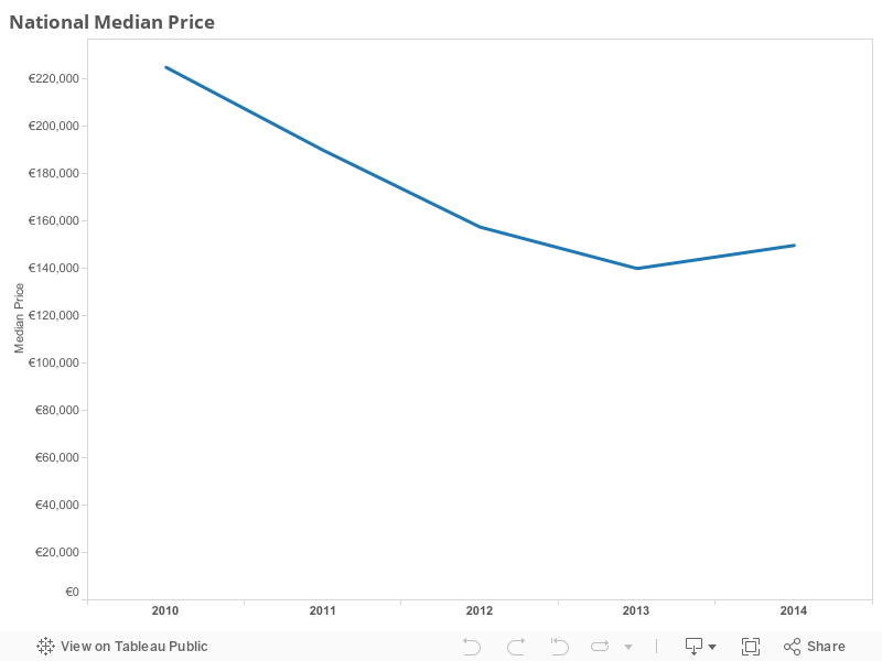
However, the next graph is one which is rarely shown in research carried out by estate agencies....the median price of homes. This graph shows that the average price of homes has not moved in tandem with the general pick-up in activity in the market which became evident in 2012. Instead it has taken until this year for a slight increase in average prices to become discernible with the national median price now up to €149,750 from €140,000 last year
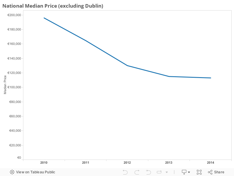
The picture is even less rosy if you strip away the effect of the surge in prices for property in Dublin which has been created by a scarcity of supply. Now we see that average prices for all parts of the country excluding Dublin have fallen steadily from almost €196,000 in 2010 to €115,000 last year.....and the bad/good news is that the trend is still downward although slowing - with prices down another €2,000 to €113,000 in 2014.
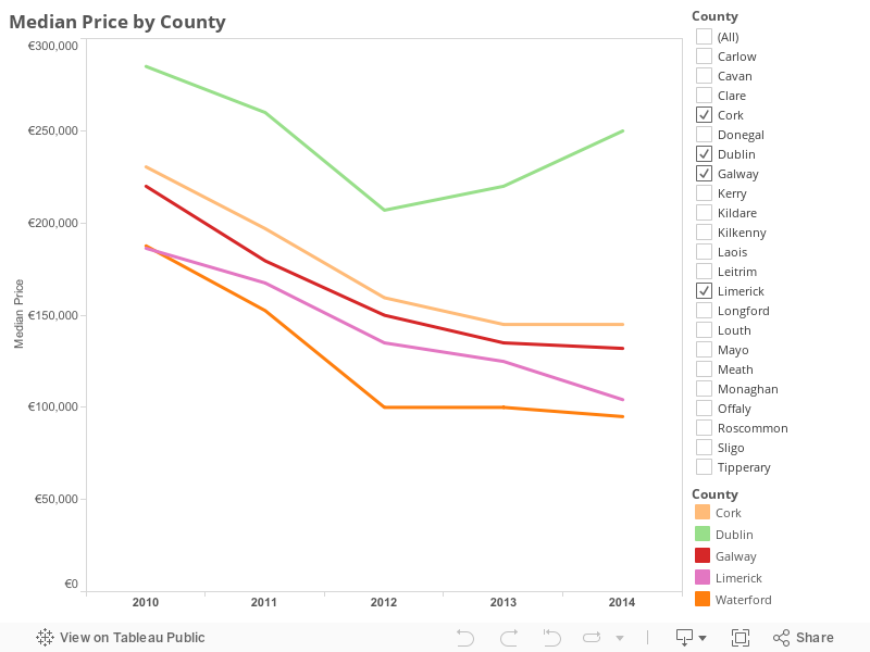
To get a breakdown of the picture around the country, you can check out the interactive graph below to see average prices in each of the 26 counties. The graph shows the trend in the counties containing Ireland's five largest cities but you can add more. As the graph shows, Dublin is really the only major urban centre to be recording real growth in house prices. As for whether it's another bubble......
.jpg)
.jpg)